A scrollmap visualizes how far down a page visitors scroll. Instead of showing interaction, it focuses on the depth of engagement — a key difference when comparing heatmaps vs scrollmaps data. Using a color gradient, it indicates which parts of your page most visitors reach and where they stop.
Scrollmaps are ideal for long-form content or landing pages because they reveal how effectively your content keeps users engaged. They can quickly show whether readers make it to your CTAs, pricing tables, or key information.
For example, if your scrollmap shows that only 40% of users reach your signup form, it’s probably placed too low. Moving it higher could dramatically increase conversions and help you understand how heatmaps vs scrollmaps insights complement each other when optimizing user journeys.
Many designers combine scrollmaps with metrics like time on page analytics to understand whether users leave because of content fatigue or poor structure.
External UX tools like Hotjar and privacy-friendly plugins such as Slimstat Analytics make implementing scroll tracking easy inside WordPress dashboards.
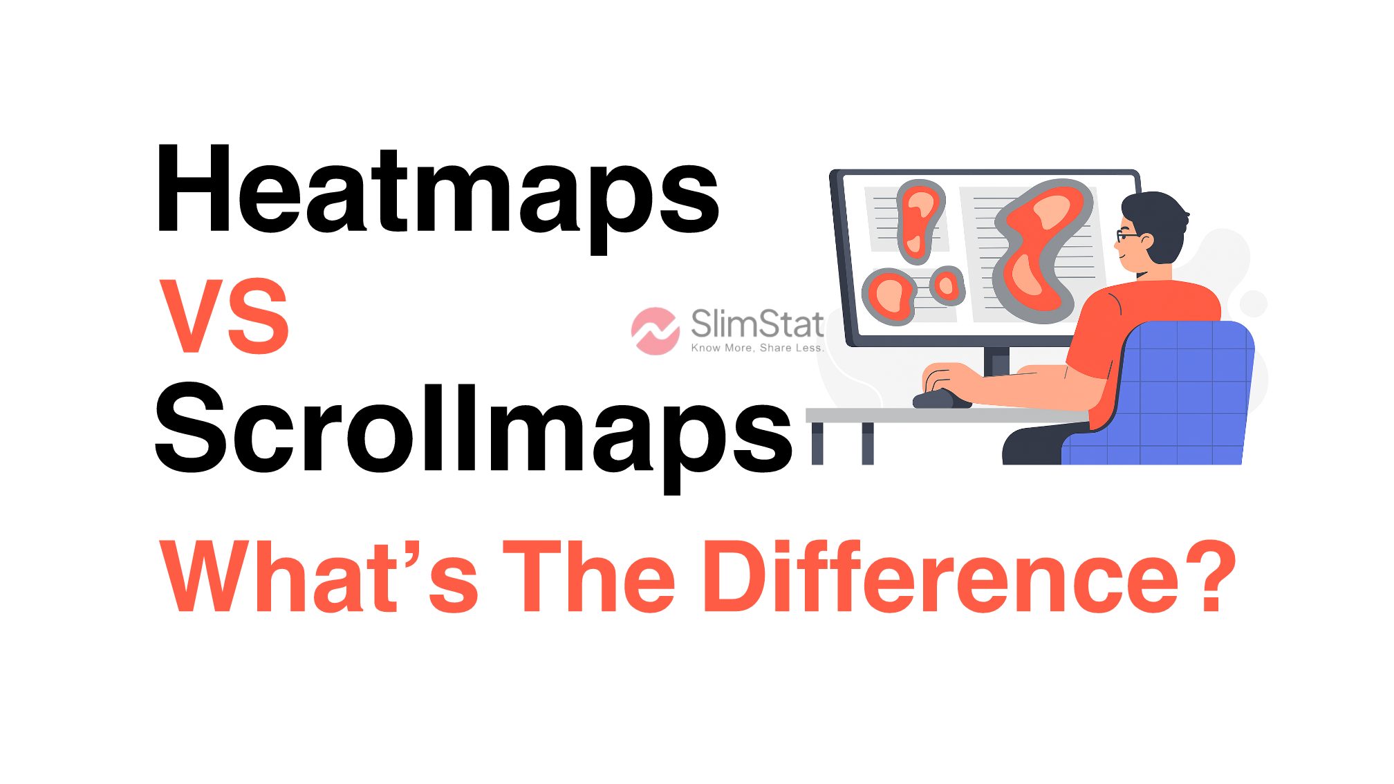
Heatmap vs Scrollmap: The Core Difference
The key distinction between heatmap vs scrollmap lies in what they measure.
| Feature | Heatmap | Scrollmap |
|---|---|---|
| Focus | User interactions (clicks, taps, mouse movement) | Depth of engagement (scroll distance) |
| Best For | Identifying high-activity areas | Checking how far visitors reach |
| Primary Data | Behavioral | Positional |
| Goal | Optimize layout, buttons, and CTAs | Improve content placement and length |
| Ideal Use Case | Landing pages, navigation testing | Long articles, sales pages |
In short, a heatmap tells you what users do, while a scrollmap shows how long they stay engaged. Used together, they give a full behavioral snapshot.
Why Heatmaps Are Essential for UX Optimization
Heatmaps provide designers and marketers with a real-time lens into what users find engaging.
1. Discover What Draws Attention
By seeing where visitors click most, you can tell which elements attract attention. This helps you adjust visuals, color contrast, and hierarchy to guide focus toward conversion goals.
2. Improve CTA Effectiveness
If your CTAs or buttons are ignored, a heatmap shows it clearly. You can test different placements or colors to drive more clicks.
3. Refine Content Layout
Heatmaps often reveal that visitors interact heavily with certain visuals or subheadings. Adjusting your layout around these “hot zones” increases retention and engagement.
The Nielsen Norman Group confirms that heatmaps are one of the most accurate ways to understand visual attention on websites.
Why Scrollmaps Matter for Engagement
Scrollmaps, meanwhile, uncover how deeply users engage with your content.
1. Identify Drop-Off Points
A scrollmap shows exactly where readers lose interest. If your traffic plummets halfway down a blog post, you may need to restructure or shorten your content.
2. Optimize Information Hierarchy
Important content buried at the bottom rarely gets seen. Move your strongest messages and CTAs higher where the majority of users stop scrolling.
3. Improve Page Experience
Scrollmaps can also highlight design issues — like overly long sections, broken layout flow, or walls of text that cause fatigue.
These insights tie closely with exit rate vs bounce rate , which helps you interpret when and why visitors leave your pages.
Combining Heatmaps and Scrollmaps for Better Insights
The most powerful strategy is to use heatmaps and scrollmaps together.
While one shows interaction and the other engagement depth, combining them helps you make more holistic UX improvements.
For example, imagine your scrollmap shows that 70% of visitors never reach your testimonials section. If the heatmap also shows minimal clicks there, it’s clear that placement — not content — is the issue. Moving it higher instantly boosts visibility.
This data synergy makes visual analytics a vital part of conversion optimization, especially when paired with behavioral metrics in tools like Slimstat Analytics.
How to Implement Heatmaps and Scrollmaps in WordPress
Adding heatmap and scrollmap tracking to your WordPress site doesn’t need advanced coding.
1. Choose the Right Tool
Pick a solution that fits your privacy and reporting needs. Tools like Crazy Egg, Hotjar, and Slimstat Analytics offer flexible, easy-to-install options.
2. Install and Configure
After installation, select which pages to track. Most plugins allow you to create separate heatmaps for landing pages and scrollmaps for long-form posts.
3. Analyze and Act
Review data weekly. If your heatmap shows users ignoring key buttons or your scrollmap reveals drop-offs before conversions, it’s time to adjust your layout or copy.
For more guidance, check out our beginner-friendly tutorial on how to add analytics to WordPress.
Common Mistakes When Using Heatmaps or Scrollmaps
Even though these tools simplify UX analysis, they can be misinterpreted. Here are common mistakes to avoid:
- Assuming cursor movement equals eye movement
- Ignoring mobile vs desktop differences
- Using outdated data after a redesign
- Treating one session as representative behavior
Accurate interpretation requires pairing visual analytics with quantitative metrics — for example, combining heatmap vs scrollmap insights with 10 essential web analytics metrics.
For additional UX strategy advice, the HubSpot guide to UX analytics is a great reference.
When to Use Heatmaps vs Scrollmaps
Choosing between a heatmap vs scrollmap depends on your page goals:
| Page Type | Best Tool | Primary Goal |
|---|---|---|
| Product or Landing Page | Heatmap | Test CTAs and layout |
| Blog or Long Article | Scrollmap | Measure engagement depth |
| Homepage | Both | Identify navigation and attention flow |
Pairing both offers the richest insight — heatmaps show behavior; scrollmaps show persistence.
If you’re managing multiple WordPress pages, consider integrating Slimstat Analytics to monitor click, scroll, and conversion data directly from your dashboard — without relying on third-party scripts.
Final Thoughts: Heatmap vs Scrollmap in UX Analytics
In the world of UX and web analytics, it’s not about choosing heatmap vs scrollmap — it’s about how you use them together.
Heatmaps visualize what users do, while scrollmaps reveal how far they go. Combining these insights uncovers both engagement and friction points, helping you design experiences that are intuitive, focused, and conversion-ready.
With a privacy-first analytics tool like Slimstat Analytics, you can bring both datasets together directly in WordPress — no external tracking or cookie dependence required.
Start testing, interpreting, and optimizing — because understanding how users interact is the first step toward making your website truly work for them.
Frequently Asked Questions About Heatmaps and Scrollmaps
What is the difference between a heatmap and a scrollmap?
A heatmap shows user interactions (like clicks or taps), while a scrollmap tracks how far users scroll down a page.
Which is better for UX analysis?
Both are valuable. Heatmaps show engagement points, and scrollmaps show visibility depth. Using both together is ideal.
Do these tools work with WordPress?
Yes — tools like Slimstat Analytics and Hotjar integrate easily with WordPress sites.
Can I track mobile users?
Absolutely. Modern tools offer mobile and tablet tracking for complete behavioral coverage.
How often should I analyze my heatmap and scrollmap data?
Weekly reviews are ideal, especially after significant design or content updates.